WiseEat
Project Type
Group project
From initial research to testing
Software / Tool
Prototype: Sketch
Presentation: InVision
Application Platform
Apple iOS
Duration
5 Days
Introduction
Food waste is an emerging issue that is escaping broader public attention. 2.2 million tonnes of edible food is wasted each year, costing Canadians in excess of $17 billion. The amount of food is enough to feed every Canadian for five months. Food losses and food waste occur throughout the entire food supply chain. In specific, 63% of edible food is wasted in Canadian households. Given the high amount of food waste at household level, prevention of food waste at the final stage of the of the food supply chain is of greatest importance.
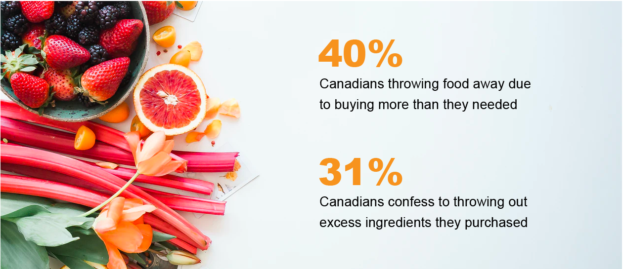

All of this raised a question:
How might we help family members align their food inventory awareness to reduce excess food purchasing?
RESEARCH
Insights
To understand the common behavior and attitudes of consumers, we decided to interview five millenniums who were responsible for either purchasing or cooking food in their household. After conducting interviews, we conducted a thorough analysis and categorized the common points as following
- Food waste most commonly occurs in Canadian households as a result of poor inventory awareness
- Miscommunication and repeat purchases result in surplus food and excess spending
- Meal planning occurs based on cravings rather than shelf life
- Canadian families are eco-conscious
Exploratory Interview Themes
Competitive Analysis
NoWaste is a mobile app that helps people to manage household inventory in order to eliminate food waste.
Pro:sort inventory by expiration date, name or category, synchronize and share inventory with family, Track food waste based on deleting the food as eaten or expired, Use the barcode scanner for swift entries
Cons: It is specialized in managing inventory and it only provides information to the users. To check each inventory before making a shopping list is time consuming. Not giving any suggestion on store food to enhance produce lifecycle and use with soon-to-expire products.

DEFINE
Opportunity
According to the interviews and market competitor findings, We have come up with areas of opportunities where we could provide solutions for the users.
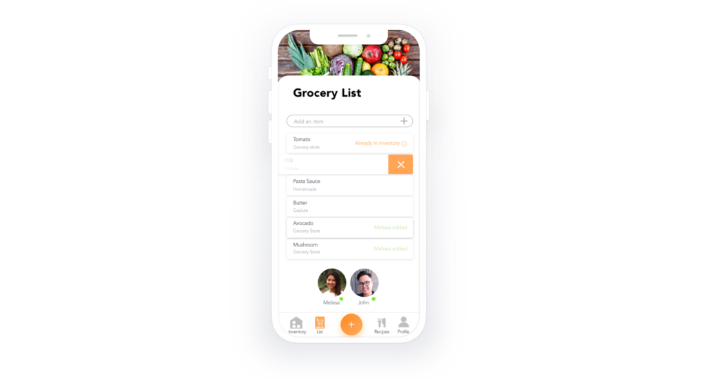
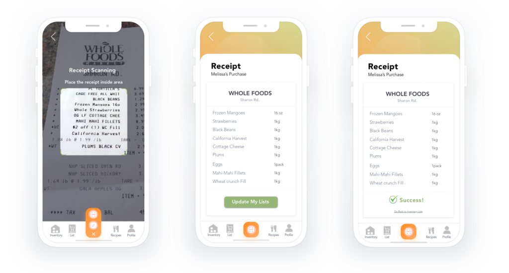
Collaborated Shopping List Help users align their grocery shopping list Inventory Awareness Help users know what is available in the inventory Smart Consumption Instant notifications on soon to be expire product, recipe suggestions to help reduce waste Feedbacks on Consumption Habits Get feedback on consumptions habits and track progressPersona
Based on the research, We create the persona that represent potential user and identity their goals and problems.

User Journey & User Flow
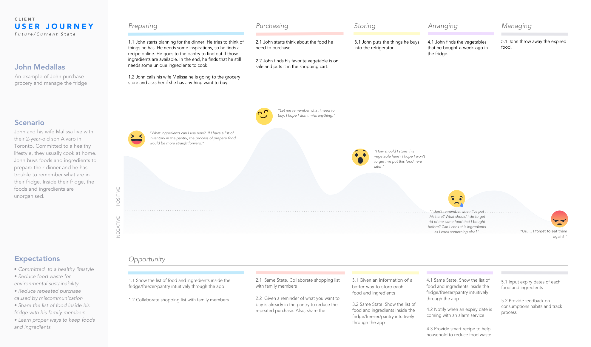
Following we are able to map out John’s journey, this help in what we want to do and give clarity of where we should focus our efforts first and how to really move the needle.
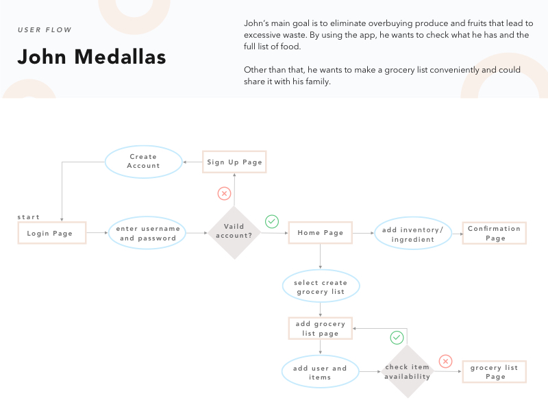
John’s main goal is to eliminate overbuying produce and fruits that lead to excessive waste.
His user journey map shows a process from purchase inventories to how he manage his fridge.
IDEATION
Sketch
- Help users align their grocery shopping App
- Help users to be aligned on their grocery list shopping list
- Help users know what is available in the inventory
- Instant notifications on the soon-to-be expired product, recipe suggestions to help reduce waste
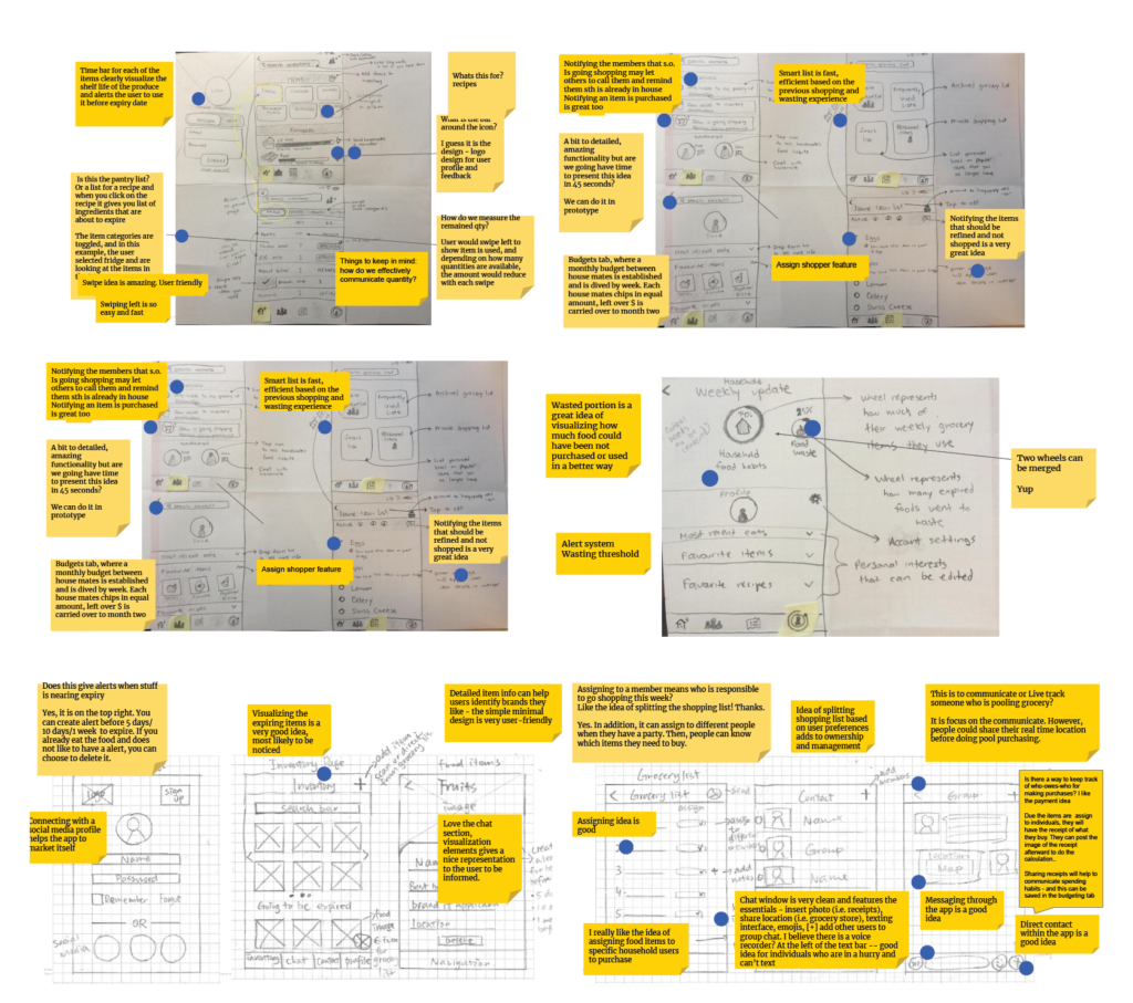
(Brainstorm)
PROTOTYPE
Wireframing & Usability Testing
After ideating, we get into wireframes and sketch a complete user journey out. We do two rounds of usability testing with 20 different testers to ensure our message was coming across. The major feedback we receive concern four areas.
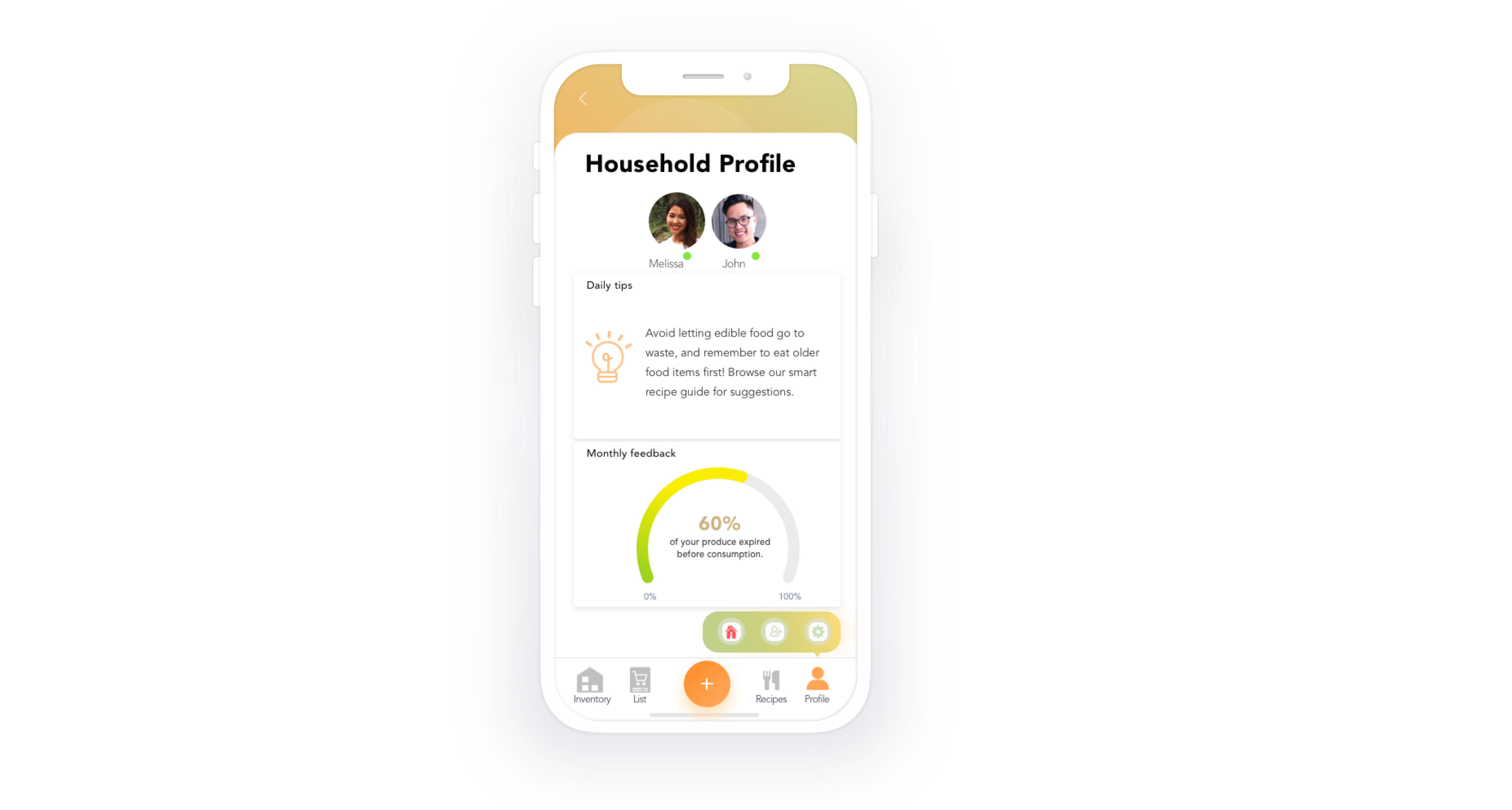
- Collaborating with other household users within the app will align grocery needs, and monthly feedback will help track habits.
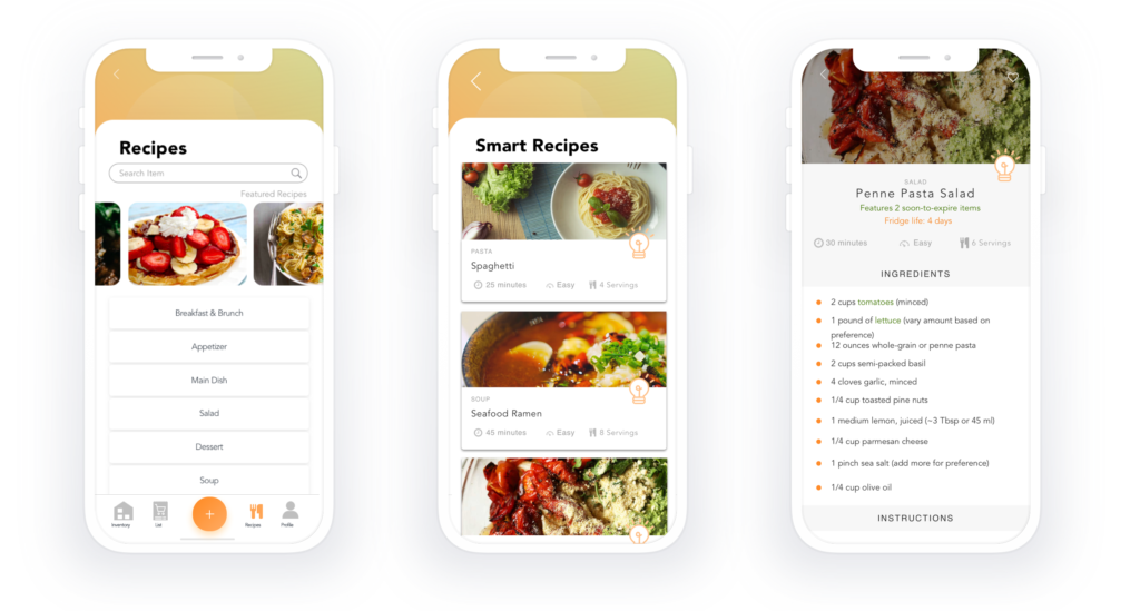
- The smart recipe guide was a useful feature to help users make smarter meal plans by using food items that are going to expire.
- Misunderstanding of buttons and icons is found confusing by our testers. Such as adding and deleting features that are under the inventory tab (swipe left and swipe right).
- It takes a bit longer for the user to figure out what is the use of the light bulb icon and how the smart recipe feature works.
Solution
Home page: Provide the list of inventories to help users know what is available in the inventory and instant notifications on the soon-to-be expired products.

Next Step
We would have loved to do user test more in the initial stages and incorporate feedback from testing. We gain important key insights as we choose a few visual elements to push the envelope and have loved a bit more feedback. But as they say, the design is a never-ending process.
- We would like to clarify our buttons and incorporate In-app tutorials.
- Sharing food statistics with family and friends would be great new addition to promote waste management.
- Tips to inform the users of best practices which we feel would help in turn motivate the user to be more conscious
Thanks for reaching the bottom of this page. If you want to learn more about me or what I’m working on, I’ve got a bunch of links for you on the right. Explore them at your own peril.
Alternatively, check out this fancy sheet of paper
Resume
